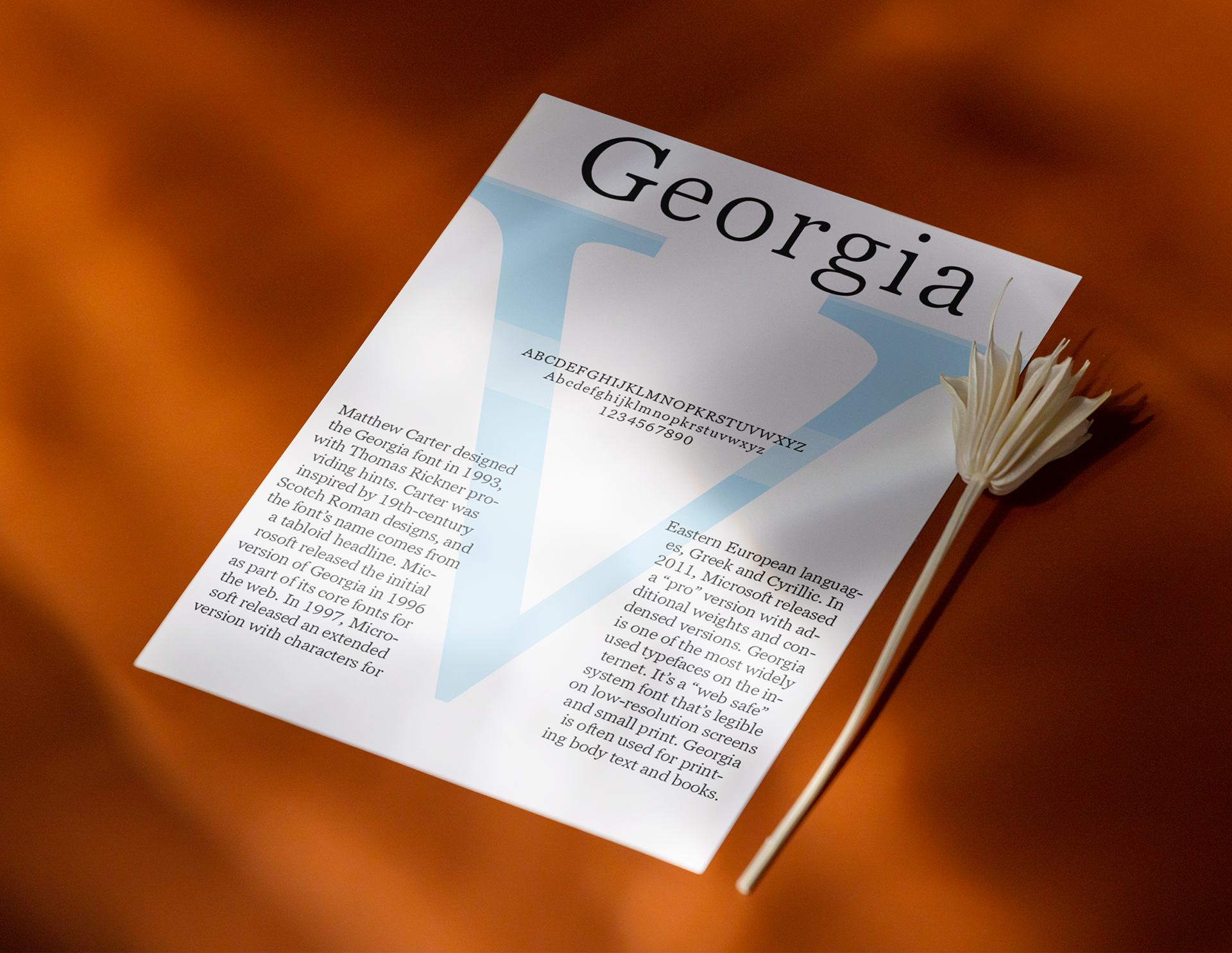
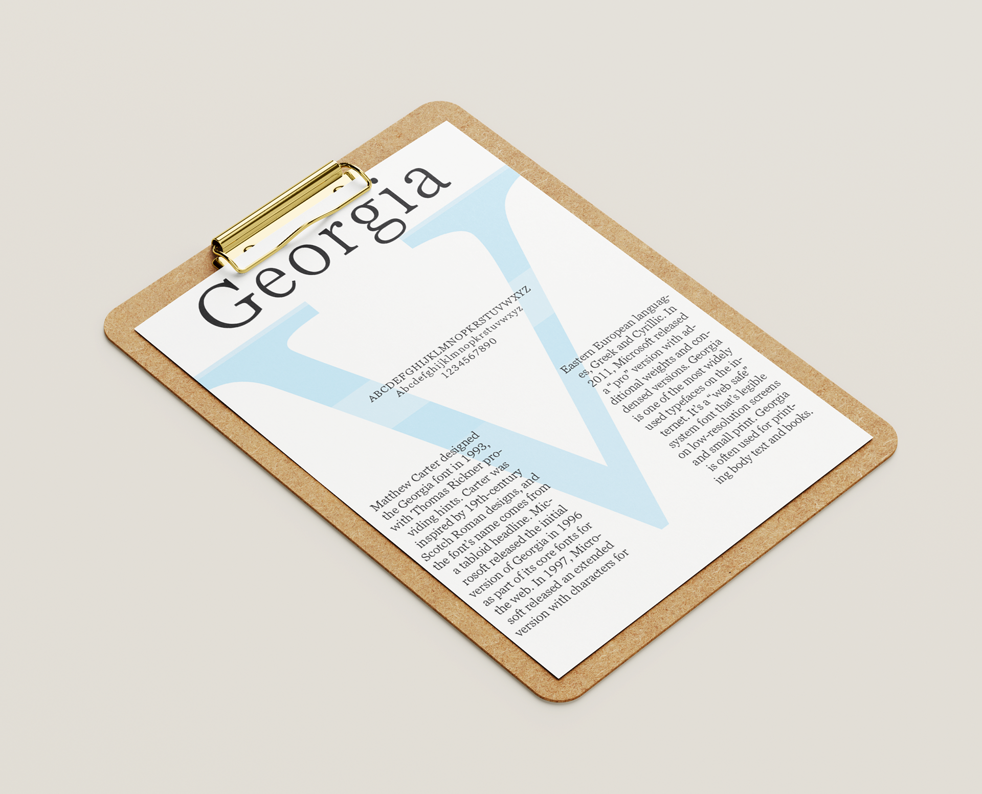
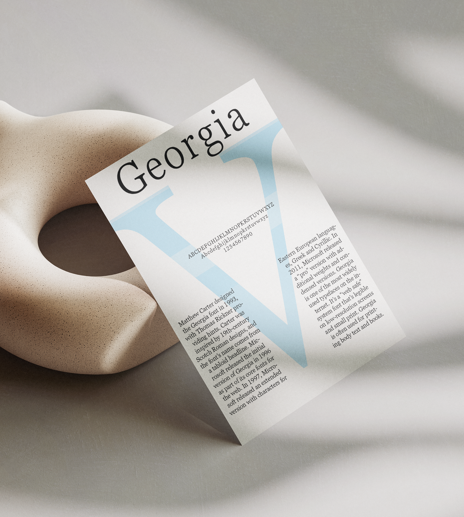
This type specimen layout showcases the Georgia typeface, designed by Matthew Carter in 1993. The piece blends historical context, typographic samples, and visual hierarchy to communicate the font’s origin, characteristics, and continued relevance. A large, transparent "V" anchors the composition while structured columns and serif text highlight Georgia’s refined yet practical design. Created for an editorial typography assignment, this project demonstrates an understanding of type anatomy, layout design, and the role of legibility in digital and print communication.